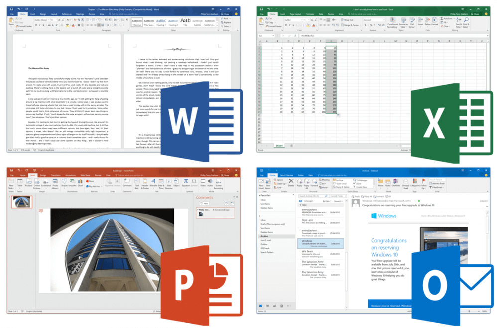
All four main Office 2016 apps shown at once: Word, PowerPoint, Excel, and finally Outlook.
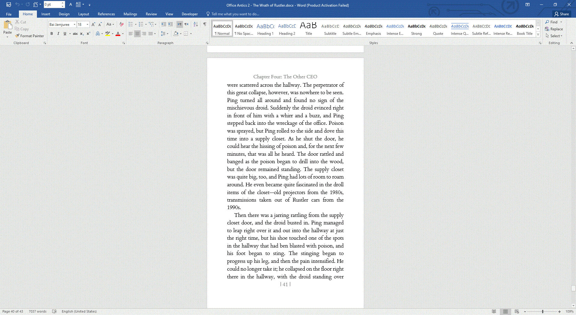
Microsoft’s latest Microsoft 365 office suite really has been on the UI redesign warpath lately; it’s gone from one design to another, and every week there’s something new. As a result, older versions of Microsoft Office are beginning to look more and more outdated as Microsoft 365 further disappears down the path of modern-looking software. As shown from the images below, Microsoft Word 2016’s design has not changed too radically compared to Office 365. The only notable change are the top bar, which no longer has a white tab outline but instead a line under the name of the tab that you have selected. However, probably the most jarring change when you go from Office 2016 to Microsoft 365 is the addition of a dark mode. Office 2016 has no such mode; its only competitor is the Grey Mode which look awful. As a result, I (and most people) leave it in Colorful mode so it doesn’t look absolutely awful. Really, that’s one of the only problems I have with using Office 2016.
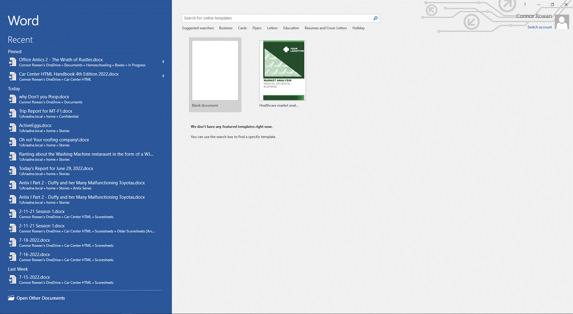
The home screen, however, is radically different in Word 2016. I mean, it’s absolutely comical in styling compared to what Office 365 has to offer. It’s split up into two panes, with the left pane being the recent documents section and the right pane being the templates section. As a result, it’s very simple, and apparently Microsoft saw this when they were redesigning Office for Microsoft 365, and went to change the whole thing. I think the home screen is definitely a lot better in Office 365; this is another problem that I have with the older design of Office 2016. But overall, I don’t think that Office 2016’s design is that old. All of the apps featured in Office 2016 have a unified design, which is good, but they all look fairly modern and not too outdated. It’s not as if you were using Microsoft Works from the 90s, or something as old as Office 2010, even. Overall, I think Office 2016’s design is still usable, but there are some hints to the design that indicate that it’s getting a little bit old and could use a redesign pretty soon, like the lack of a dark mode and the simplistic home screen. (Yes, Microsoft, a once-simple company, has taken to designing extremely complex and modern-looking software.)


