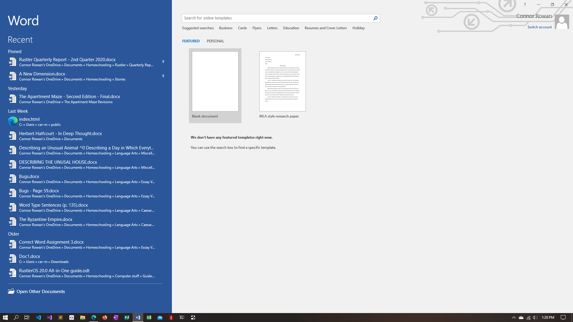
Shown here is the classic Microsoft Word 2016 in the beloved "Semi-White" theme.
In the past, Microsoft has had a history of changing things that were already good and making them worse, such as with Microsoft Office. Currently, everyone uses Office 365 instead of Office 2016. However, the new Office 365 UI is somewhat different from the previous version, Office 2016.
It is in a way. Most of the same features have stayed there, but the home screen has completely been rearranged. In Office 2016, the Recent Documents pane was smaller and on the left, unlike the current Office, where it’s in the center and much larger. Honestly, the older design seems much more sensational, and the Featured Templates screen to the right of the Recent Documents pane is larger in Office 2016. In 365, it is a small bar at the very top of the software. I think it should be much larger than that, just below the size of the whole center pane.
The document editor is mostly the same, though the default theme that (Word) Office 2016 has just a little bit better than the dark theme in Office 365 or Microsoft 365. It is light, however, it is not the blasting full-white theme that you would find in your average software or webpage. It is a slightly dimmed white, and mixed in with the blue Microsoft Word theme, it’s probably one of the best themes that Microsoft has ever implemented into Office.
All of the other apps have the same changes, though their color schemes stay the same. However, the one thing that makes the most difference is the app logos. In Office 2016, each app looks like a folder or book, with the first letter of the app name on it and a background of the app’s theme color. This nifty design is removed in Office 365 when it is moved to a solid square with the app’s theme color and the first letter of the application in a smaller square slightly to the left of the app.
The changes from Office 2016 to Office 365 are very subtle, but they can be noticed…if you look very, very closely.


